Microsoft Power BI
Connect and visualize all of your data with easy-to-use business intelligence software from Microsoft
Drive Your Business with Data
Data is nothing short of one of your greatest assets.If you're like many organizations, you have treasure troves of data waiting to be used for intelligence.
VNKS can help you put all your data to work using the tools you have, aggregating your datasources in Power BI and simplify report sharing through your organization.
- Define what truly drives your business and business results
- Unify your strategies and organizational direction
- Maximize efficiency and utilization of your existing resources
- Uncoverotherwise hidden opportunities for business improvement
- Centralize and simplify company access to important information
Power BI Desktoplets you build analytics without the need for technical expertise. It contains all the capabilities to connect, shape and share insights through Power BI with a flexible and fluid canvas, including drag-and-drop content placement.
Power BI includes mobile apps that allow users to view their personalized dashboards and reports anywhere, any time. Native to Windows, Android and iOS, you'll enjoy a consistent experience across platforms and devices.
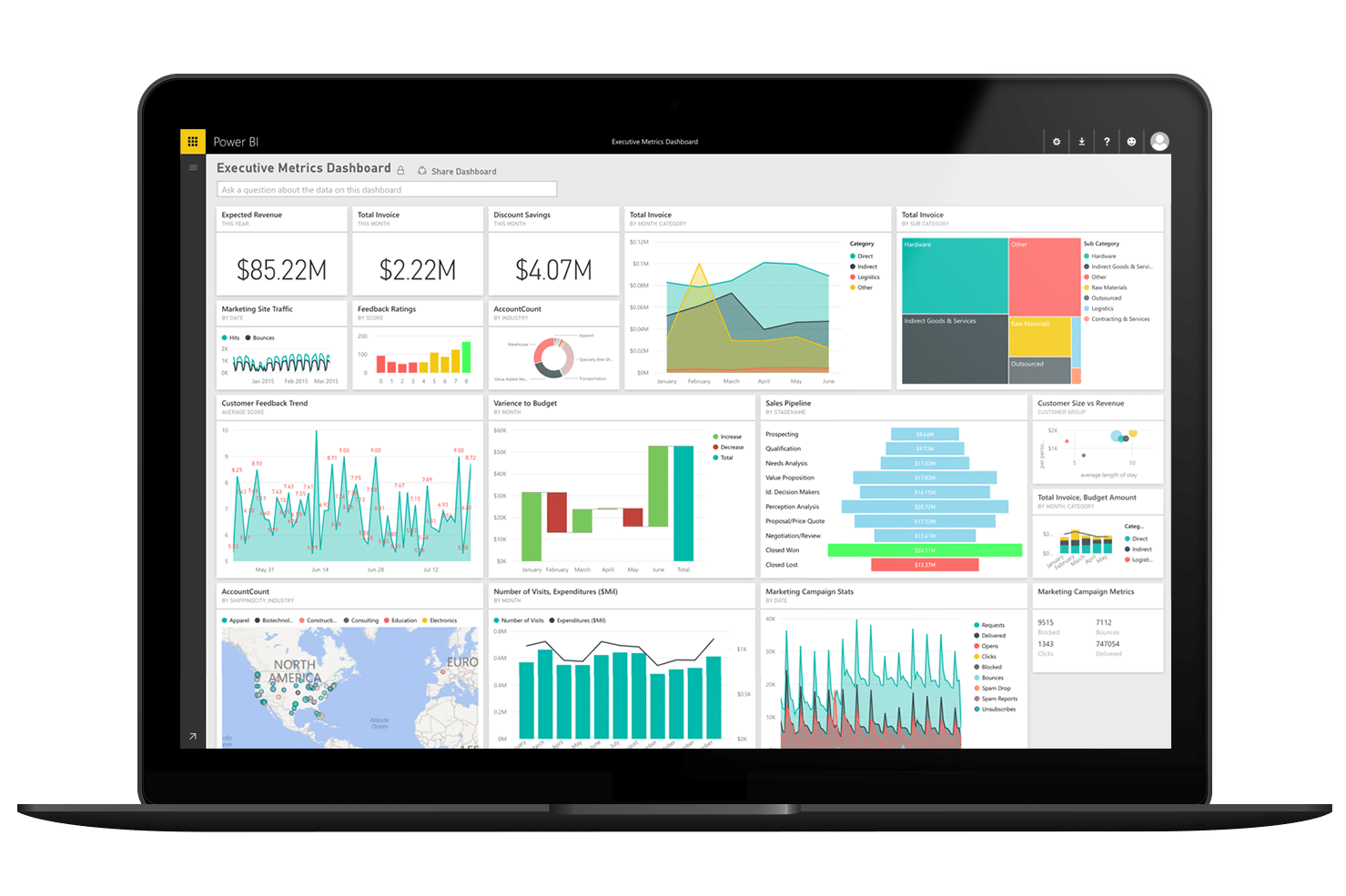
See Power BI in Action
Use the arrows < > at the bottom of the report to navigate between pages.
Click the titles to the right toview page-level descriptions.
Page one of ourconvenience store demo is a simple overview of the key sales metrics when analyzing a C-Store's performance.
In the Center of our page are three large KPI (Key Performance Indicator) tiles that focus on Total Sales, Total Customer Count, Total Fuel Sales (Gallons). The large value in the center of the tiles change between Red, Yellow, and Green depending upon their relevance to the target 'Goal' value shown below in a smaller text.
On the bottom of the page, we have a simple bar chart that shows Total Sales over a time period. Power BI's drilldown functionality allows us to not only view Total Sales by Month, but also by Year, Quarter, and Day. Select the arrows in the upper left corner of the chart to interact with this functionality. You may also notice by hovering over a specific bar on the chart, you are provided with more details on the specific metric. Ex: Total Sales amount and time range selected.
As stated in our overview of the overall report, we tend to keep our filtering/slicers in a uniform layout throughout. Our date slicers are across the top and individuals can filter by Store Category, Descriptions, and Store Names on the left hand side of the report.
Interact with the Sales Overview page to explore Power BI's functionality!
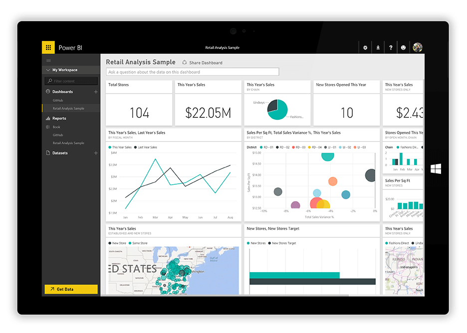
Page two of our C-Store demo has somewhat of an overview appearance to it, but focuses more on key yearly sales metrics: Total Sales, Total Sales Previous Year, Total Sales Delta, and Year-Over-Year Sales Growth.
The top of our page shows a visual called a 'Card.' A card simply shows one value for the metric that is associated with it and can change based upon the slicer selected on the page.
The top of our page shows a visual called a 'Card.' A card simply shows one value for the metric that is associated with it and can change based upon the slicer selected on the page.
On the bottom of the page we have a simple Matrix that analyzes our sales data by Store Name, Store Category, Code, and Description. It also shows this data by year, so we can analyze across multiple time periods if necessary.
One final key feature of this page is the slicer/filter in the center outlining Total Sales, Total Sales Previous Year, Total Sales Delta, and Year-Over-Year Sales Growth. This slicer is directly affects the matrix below it. It is a way to show either all four sales measures, or just the ones we want to see.
Interact with the slicers to see how the report operates! Hold down the CTRL key while selecting if you want to make multiple selections.
Page three of our C-Store demo provides more of an in-depth look at how our stores are performing. This page is intended to provide the user with more information to understand the 'Why' behind the data on the Overview and High-Level types of pages.
Each visual tells its own story. The visual at the top of the page, 'Monthly Sales KPIs', provides us with a 'High Level' view of key metrics for the company. While the Matrix at the bottom, 'Historical Sales Metrics', allows us to dive deeper into our measures and analyze what is actually driving our figures.
Our Total Sales TY vs Total Sales LY is a simple line chart that visualizes Sales trends from one year selected in the year filter. To its right, we can see YOY Sales growth, by not only Store Name, but by Description as well. This allows us to see 'What' item is over/under performing and ask the questions 'Why' is it, or isn't the item selling better than others.
In the bottom right corner, you will notice a bar chart that compares YOY sales growth by Store Name and Year. It's a simplistic way to know if your stores are continuously improving year to year.
Select the three dots in the top right corner of a visual (.) to download the data into Excel!
Page four has a simple concept, but displays a powerful message. We have had many customers find great value in using the line chart in order to view trends over time to ensure they are improving year over year. If a trend on these charts looks 'off', either too high or too low, they can drill down into their data to find out 'Why.'
Our top line/trend chart shows Total Sales and Sales Growth by the time metric selected or drilled down to. While the bottom trend chart shows Total Fuel Sales and Fuel Sales Growth.
Hover over each chart to view the data associated with the area of the chart you are interested in. Click on a particular line to focus solely on that year and metric.
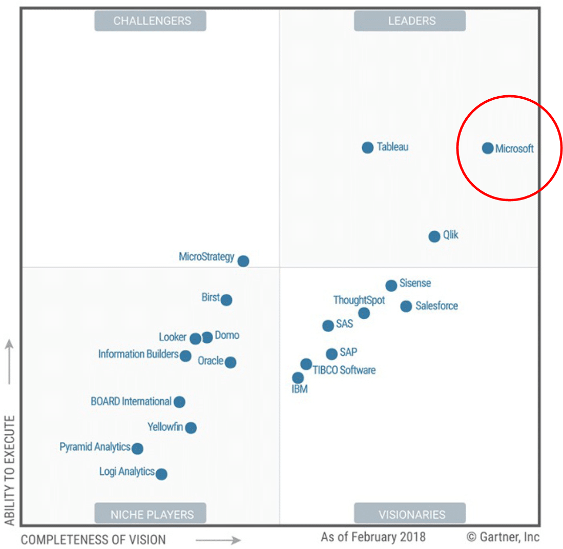
The Leader in Self-Service Analytics
For 11 consecutive years
On-DemandWebinar
Connecting Data and Driving Efficiency with Power BI
Share data and drive efficiency across your organization
As digital technology continues to sky rocket, so will the usefulness of the data you collect.Do you know how to use this data to your advantage?
Learn how Power BI puts the power of data in the hands of your people.
Award-winning Partnership
Learn how we help our clients achieve faster time-to-value.